Photo Vault Online - help with calibration
Use this link to download the latest set of calibration images: Download calibration images
How to use these images
This guideline is of help to everybody participating in national and international photographic competitions because:- Many modern displays have a much larger gamut (see definition below) and in most cases it is not an industry standard gamut. These displays advertise their gamut as "Wide Gamut", or in some cases more specific such as a gamut of "78% of AdobeRGB".
- A few years ago it was "safe" to assume that most targets (home computer screens and projectors) will only have a gamut of sRGB.
- Clubs and home users may use a variety of photo display software, and it is important to understand how to prepare your display software for the target device where the device may be able to display a wider gamut than sRGB.
- In a modern digital workflow it is important to use colour aware software.
The above download link include two sets of calibration images, one set for the XGA format (1024x768 pixels) and one set for HD screens (1920x1080 pixels). Images 1 to 9 is in XGA format while images 10 to 18 is in HD format.
Definitions
Colour Management
In digital photography, colour management is the controlled conversion of a photo from the original tagged or embedded profile (source profile) for the device that will be used to display the photo (target profile).Gamut
Gamut is the entire range of colours available on a particular device such as a monitor, projector or printer. A defined gamut is also known as a colour space. We will therefore talk about the sRGB colour space, which means the range of colours represented by the industry standard sRGB definition.Colour Profile
A colour profile is the lookup table "explaining" the gamut used during the preparation of a photo. Colour profiles may be an industry standard profile such as sRGB, AdobeRGB or ProPhotoRGB, or it may be a custom profile created for a specific device. Digital printers will for instance have different colour profiles available for each printer model and even for each type of photographic paper.Tagged Profile
A digital photo may contain a tag in its Exif data to “explain” what industry standard profile was used during the creating / preparation of the photo. If a photo does not contain information about a profile, sRGB profile is normally assumed as it is the lowest common denominator. A tagged profile will always refer to one of the industry standard profiles, such as sRGB, AdobeRGB or ProPhoto.Embedded Profile
A digital photo may contain a non-standard embedded profile (a lookup transformation table) "explaining" how to interpret each colour value used in the photo. Nikon Cameras will for instance embed their own version of AdobeRGB in its digital photo files when the camera was setup to capture using the AdobeRGB gamut.Colour Aware Software
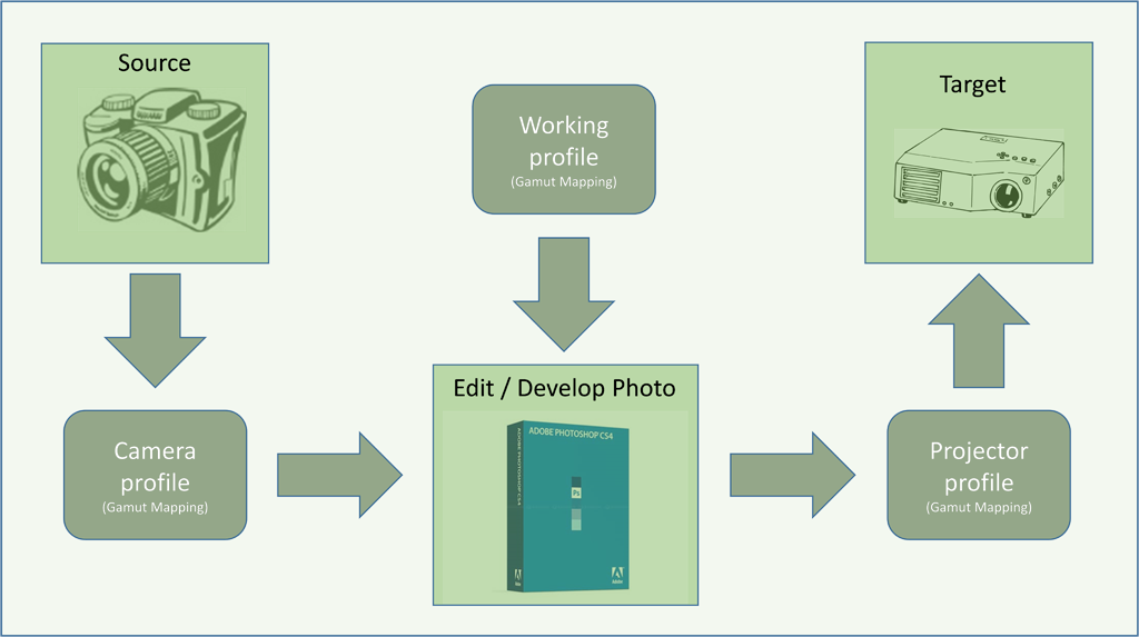
Colour aware software is software that allow you to setup / configure the software to make use of colour management for the display of a photo.The following diagram shows a simplified work flow of a photo taken on a digital camera, developed in Photoshop and display on a digital projector.
Setting up your colour aware viewer software.
PSSA still recommends the use of IrfanView for a Microsoft Windows environment, but they do not promote the use of IrfanView on Apple Mac computers in a Microsoft Windows simulated mode. This is because the simulated mode makes use of a virtual screen driver that may not be able to represent the full capabilities of the Apple Mac’s physical display card and none of the operating system’s automatic colour management features is used in the Microsoft simulated mode. For Apple Mac users the built-in "Preview" software is (limited) colour aware and is recommended. Please make sure to set the software up not to resize the photo to full screen. Alternatively, if you are using Adobe Photoshop, you may make use of Adobe Bridge, which is also a great colour aware photo viewer.Important differences in the use of IrfanView:
PSSA recommends the use of colour management in IrfanView. But the current version (version 4.38 at the time of writing this) does not have colour management built in. To enable colour management in IrfanView, you need to download and install the IrfanView plug-ins which contains a plugin wrapper for LCMS. With this plug-in installed, Irfanview becomes a full colour aware viewer.The colour management setup is broken down into two important steps.
- Ensure you have the correct brightness and contrast
- Ensure your colours will display correctly without any colour cast.
Using the PSSA calibration images.
The PSSA calibration images are broken down in 3 major groups.- The first group is to check / fix the brightness and contrast of your display (Images 01, 02, 03, 10, 11, and 12).
- The second group is to ensure there is no colour cast (Images 04, 05, 13, and 14).
- The third group contains a set of "real life" photos that will alert you if your calibration and/or setup is not correct – almost like the "canary in the cage" mine alert system (Images 06, 07, 08, 09, 15, 16, 17, and 18).
Images 01 and 10 – Confirm the Contrast
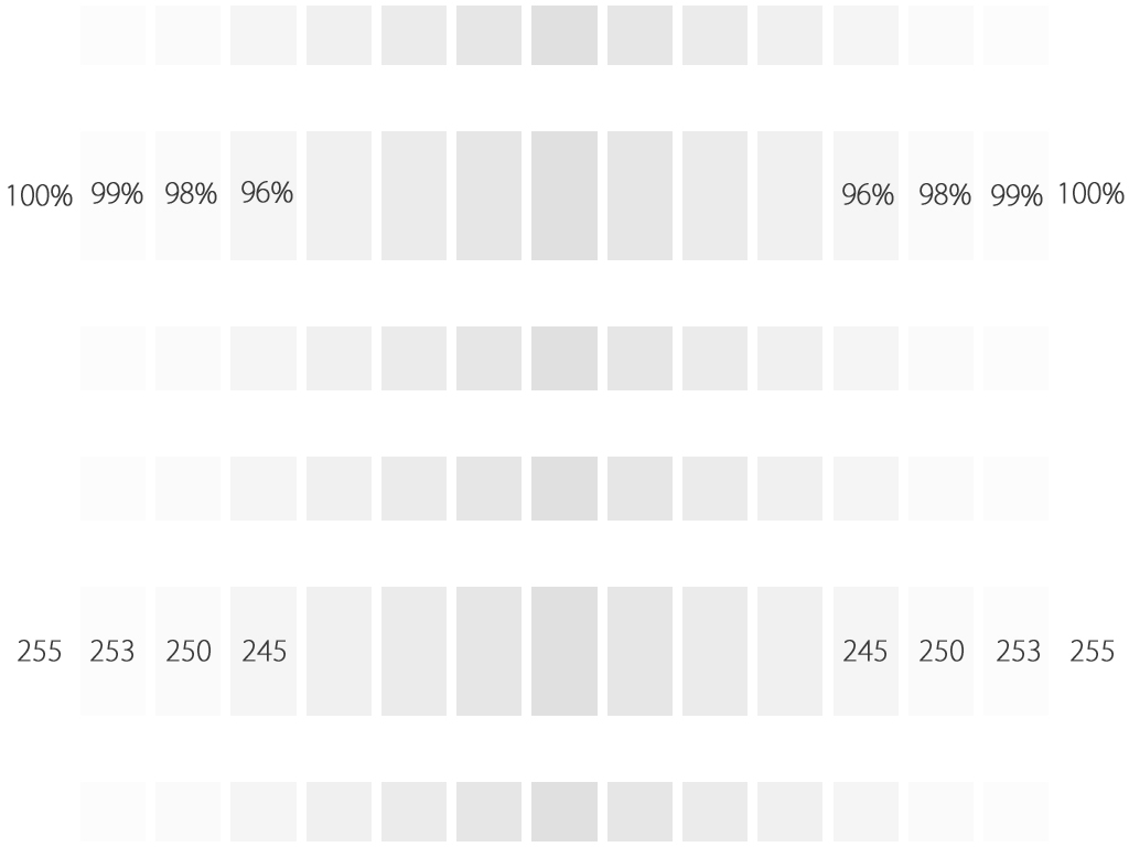 This chart shows blocks from pure white to about 80% darker than pure white. On a projector it is recommended that you change the contrast to see at least 96% of pure white.
On most projectors it is possible to get a setup where you will be able to see 98% of pure white, and on a home LCD display with a luminance rating of
280cd/m2 or brighter it will be possible to see 99% of pure white.
This chart shows blocks from pure white to about 80% darker than pure white. On a projector it is recommended that you change the contrast to see at least 96% of pure white.
On most projectors it is possible to get a setup where you will be able to see 98% of pure white, and on a home LCD display with a luminance rating of
280cd/m2 or brighter it will be possible to see 99% of pure white.
To setup the contrast, take the contrast down/up until you do not see the 96%. Then slowly change it back one step at a time until you seen the 96%, then change it one step at a time until you see the 98%. If you never see the 98%, reset and start again with trying to get the 96% to show, but stop once you managed to see the 96%.
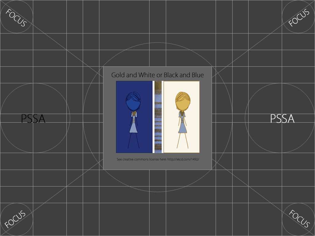
Images 02 and 11 – Check the focus
 Although the focus chart is only of value for projector setup, it is placed between the contrast and brightness charts in order for your eyes to
adapt to the lower light conditions of the brightness chart. For this reason, the background of this chart is a very dark grey.
Although the focus chart is only of value for projector setup, it is placed between the contrast and brightness charts in order for your eyes to
adapt to the lower light conditions of the brightness chart. For this reason, the background of this chart is a very dark grey.
When setting up a projector, make sure that all 4 corners are in focus. Use the words "FOCUS" as well as the circles around the words to confirm focus.
Another test is to make sure that the vertical and horizontal lines are shown as smooth solid lines without any jagged (toothed) effects. If the thin line on one of the sides are not visible, then you will need to change the refresh rate and/or the sync speed of your display.
Side Note:
Some time ago a photograph of a blue dress went viral on the social media websites. Some people saw the dress as black and blue while other people thought it is white and gold. Note how the colour of the dress looks different on the left from the dress on the right, yet, if you use a colour picker you will see that they are exactly the same hue – it is the use of the specific background colours that create this illusion!This is a great example of how subjective our visual perception is, and this is the main reason PSSA recommends the use of a hardware device for calibration (see previous section) to ensure an objective result. This image is included with the permission of the author. Read more about this dress at the author's website using this link: http://xkcd.com/1492/.
Image 03 and 12 - Confirm the Brightness
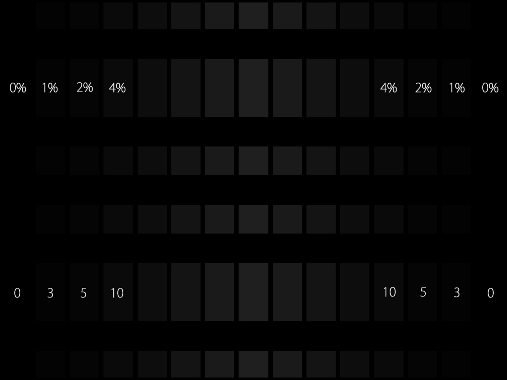 This chart shows blocks from pure black to 4% away from pure black (and a little bit more). On a projector, you must be able to see at
least the block marked as 4%, but preferably even the block marked as 2%. On an LCD display with a luminance rating of 280cd/m2 you will be able to see the
2% difference clearly and possibly also the 1% difference.
This chart shows blocks from pure black to 4% away from pure black (and a little bit more). On a projector, you must be able to see at
least the block marked as 4%, but preferably even the block marked as 2%. On an LCD display with a luminance rating of 280cd/m2 you will be able to see the
2% difference clearly and possibly also the 1% difference.
Follow the same steps as discussed on the contrast chart to get the best possible brightness setup, but this time change the brightness setting of the screen, rather than the contrast setting.
Image 04 and 13 – Familiar colour checker
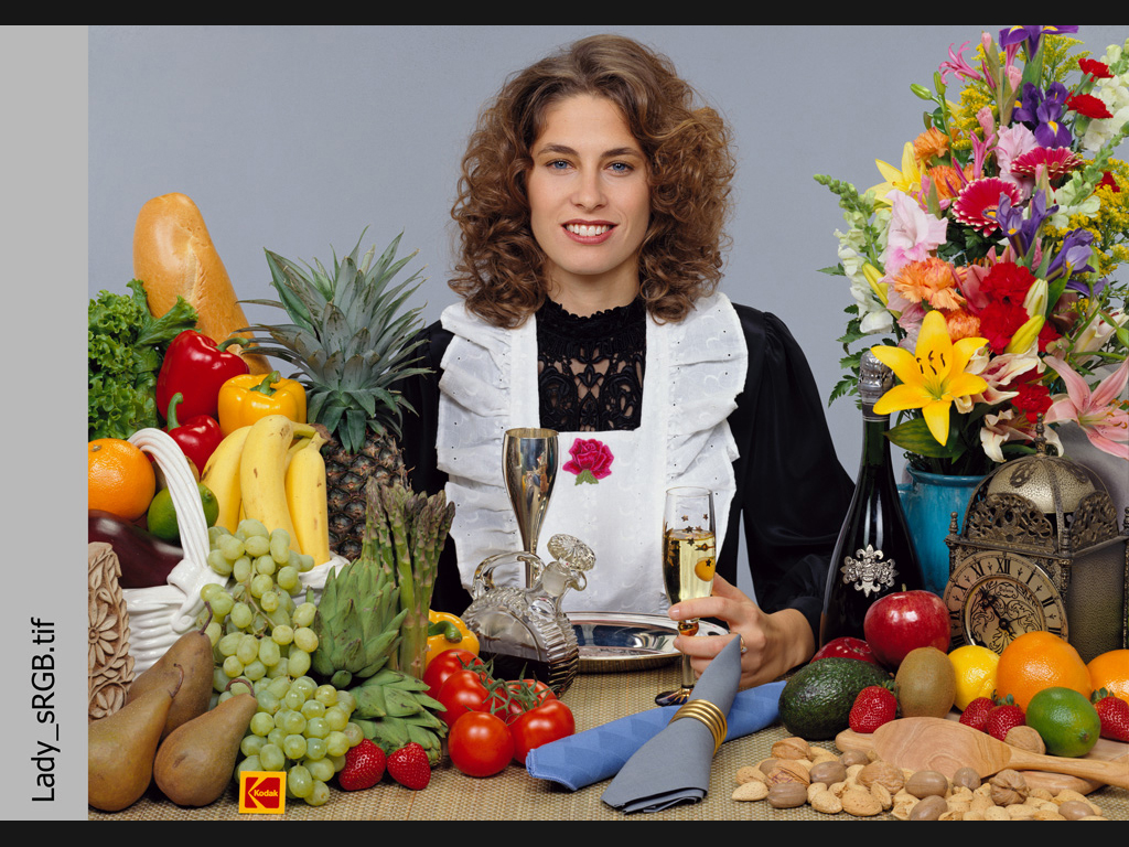 We include our two familiar colour charts as it is a good way to compare our objective observation of colour from one device to another. Concentrate on the
colours of the bananas, the tomatoes, the red apple, the green grapes as well as the yellow day lily in the flower arrangement.
You may also use the embroidery on the white apron to confirm the correct contrast and the folds of the black dress on the lady's
arm to confirm the brightness. The embroidery detail on the white should be visible, while at least two of the folds on the arm of the black dress must be slightly visible.
We include our two familiar colour charts as it is a good way to compare our objective observation of colour from one device to another. Concentrate on the
colours of the bananas, the tomatoes, the red apple, the green grapes as well as the yellow day lily in the flower arrangement.
You may also use the embroidery on the white apron to confirm the correct contrast and the folds of the black dress on the lady's
arm to confirm the brightness. The embroidery detail on the white should be visible, while at least two of the folds on the arm of the black dress must be slightly visible.
Images 05 and 14 – Check for a colour cast on monochrome images
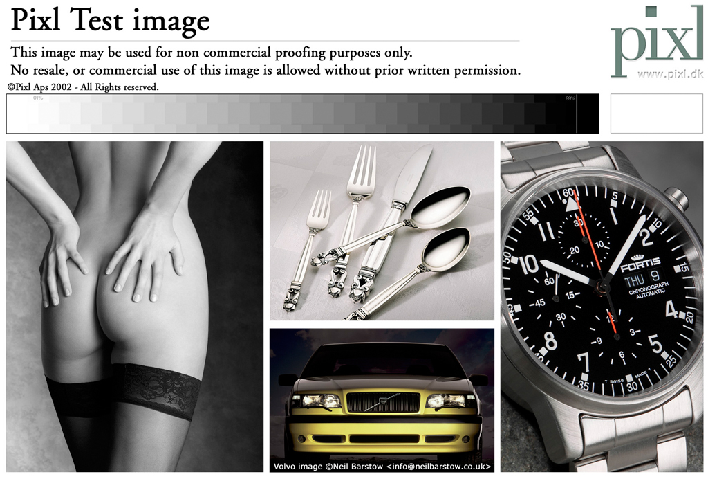 This familiar image is used to confirm no colour cast. The image on the left is a monochrome image and must display as a neutral grey without any colour cast.
The top middle photo is not a monochrome photo and should display a warm cream colour. The embroidery of the cloth may also be used to
confirm the correct contrast, while a small bright triangular spot on the stockings of the model's left leg is used to confirm
correct brightness.
This familiar image is used to confirm no colour cast. The image on the left is a monochrome image and must display as a neutral grey without any colour cast.
The top middle photo is not a monochrome photo and should display a warm cream colour. The embroidery of the cloth may also be used to
confirm the correct contrast, while a small bright triangular spot on the stockings of the model's left leg is used to confirm
correct brightness.
We received permission from the author to use this image as part of our calibration images.
Images 06,07, 15 and 16: confirm correct handling of the embedded profile and the RED channel
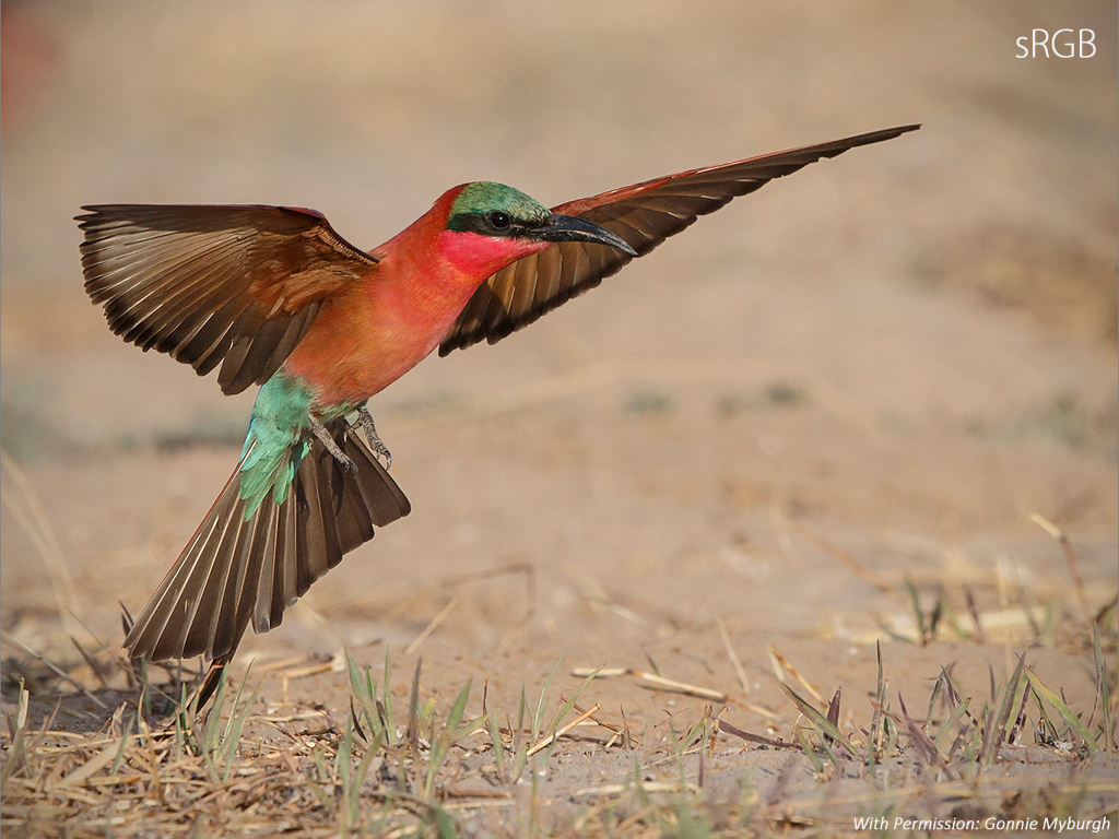 These images serve two purposes, firstly, it is a check for the RED channel of this RGB photo. On an incorrectly calibrated system, the red detail
below the beak of this Carmine bee-eater is easily losing individual detail of the feathers. Secondly, we provide two versions of this photo, the
first one is converted to sRGB while the second one is in AdobeRGB.
These images serve two purposes, firstly, it is a check for the RED channel of this RGB photo. On an incorrectly calibrated system, the red detail
below the beak of this Carmine bee-eater is easily losing individual detail of the feathers. Secondly, we provide two versions of this photo, the
first one is converted to sRGB while the second one is in AdobeRGB.
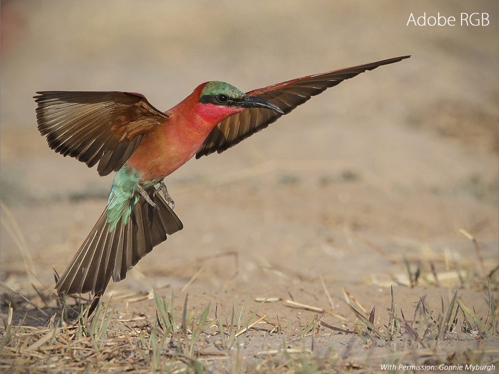 If a viewer is not colour aware, the second photo will look dull or without
the necessary "punch". In a colour aware photo viewer, you will not easily see a difference between the sRGB and the AdobeRGB version – especially
if your display is calibrated and a hardware created profile was applied.
If a viewer is not colour aware, the second photo will look dull or without
the necessary "punch". In a colour aware photo viewer, you will not easily see a difference between the sRGB and the AdobeRGB version – especially
if your display is calibrated and a hardware created profile was applied.
Images 08 and 17 – Confirm the GREEN channel
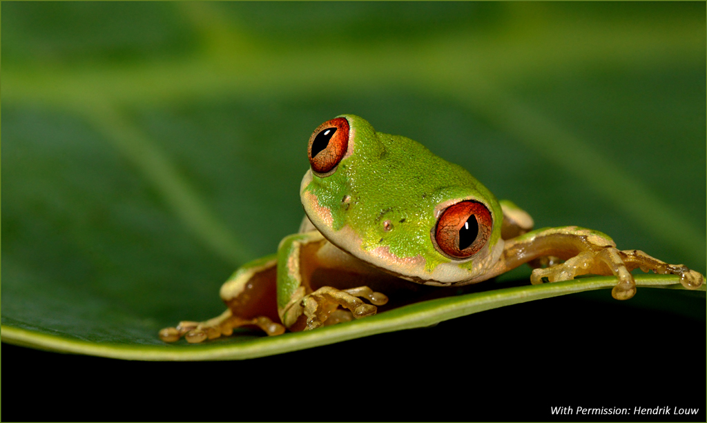 This photo is used to confirm that greens will show correctly on a well calibrated system. This macro photo has the typical shallow depth of
field. The contrast of the photo is high to create the necessary "punch", but not so high as to introduce unnecessary artefacts. But, on an incorrectly
calibrated setup where the contrast is too high, the out-of-focus background on the left starts to show a loss in fine detail. If this is the case,
change your contrast or re-calibrate to create a setup with the correct contrast.
This photo is used to confirm that greens will show correctly on a well calibrated system. This macro photo has the typical shallow depth of
field. The contrast of the photo is high to create the necessary "punch", but not so high as to introduce unnecessary artefacts. But, on an incorrectly
calibrated setup where the contrast is too high, the out-of-focus background on the left starts to show a loss in fine detail. If this is the case,
change your contrast or re-calibrate to create a setup with the correct contrast.
Images 09 and 18 – Confirm the blue channel
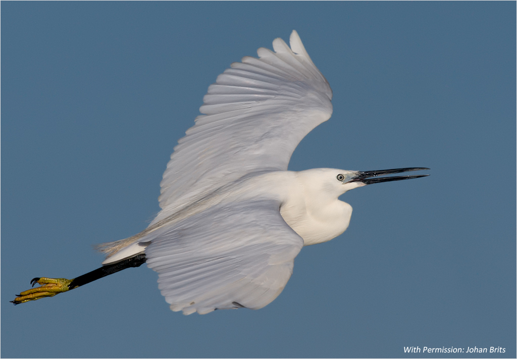 In digital photography, the blue channel is known as the "noisy channel". In most digital photographs where a large portion of the photo
contains a blue sky, digital noise will be visible on close inspection, even at 100 or 200 ISO! The trick is to keep the noise to
an acceptable level and this photo was process to the point that it is just acceptable. On a correctly calibrated system, this photo has the correct impact
because of the detail on the white feathers while the sky is a perfect blue. But on close inspection noise (acceptable) is visible in the sky.
In digital photography, the blue channel is known as the "noisy channel". In most digital photographs where a large portion of the photo
contains a blue sky, digital noise will be visible on close inspection, even at 100 or 200 ISO! The trick is to keep the noise to
an acceptable level and this photo was process to the point that it is just acceptable. On a correctly calibrated system, this photo has the correct impact
because of the detail on the white feathers while the sky is a perfect blue. But on close inspection noise (acceptable) is visible in the sky.
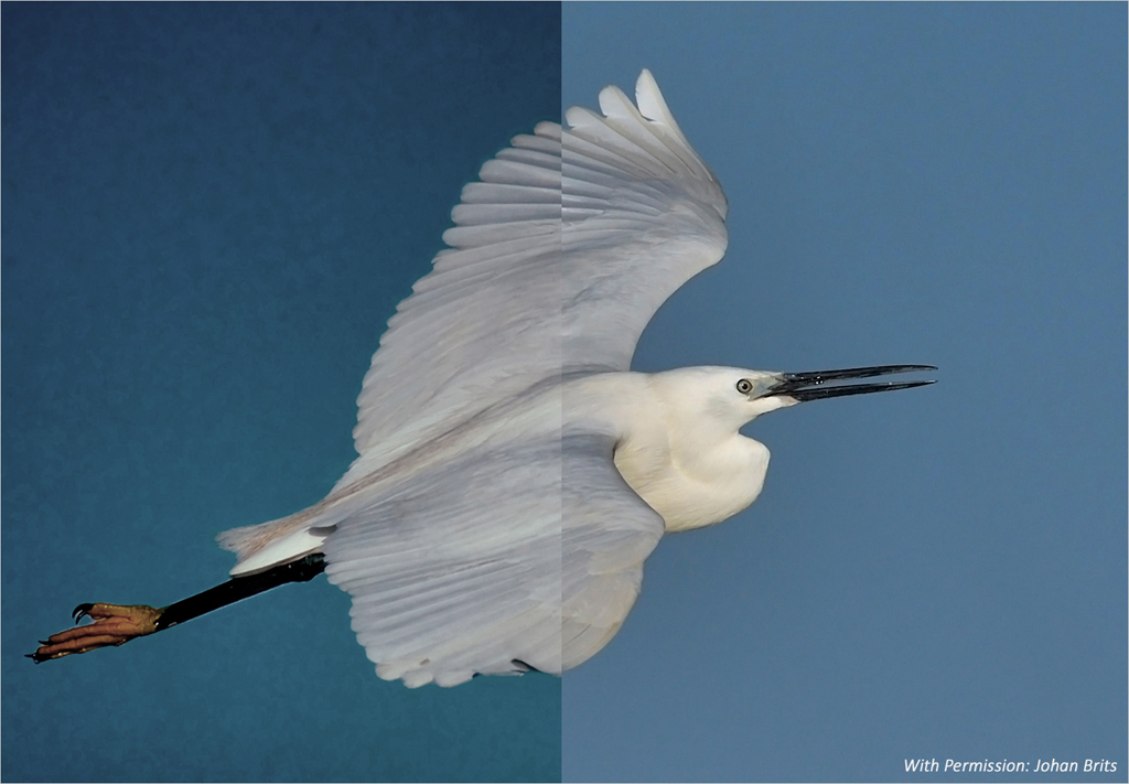
On an incorrectly calibrated setup this noise will become very prominent to such an extent that the photo will not be seen as correctly processed. The left side of the photo on the next page is an extreme example where this photo is showing processing artefacts in the blue sky that is totally unacceptable, but in fact it is the exact same photo as the one above without any extra processing, it is just the way the viewer was configured that differs!
Side Note: How did we achieve this very incorrect rendering in this photo? The original photo was processed and converted to sRGB before saving. The sRGB tag was saved in the EXIF data.
The viewer (IrfanView) was setup to use colour management.
A custom profile was selected, but the profile selected was the profile created during calibration.
This will result in the incorrect display of the photo. There is a term for this incorrect setup method:
It is called "Double transformation".
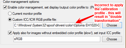 What it means is that the photo is converted from sRGB to the profile that was created during calibration.
During display, this converted photo is then passed on to the graphics card of the PC, which will apply yet another transformation to the same profile before it
is displayed. (The colour cast and vignette is a result of the photo being directly photographed from the projected screen in order to show the projected artefacts.
These artefacts did not show up using the standard Windows screen capture function.) The correct way will be to either select “Current Monitor Profile” or to
select the Windows built - in "sRGB Color Space Profile" in the viewer software, to ensure all photos are converted to sRGB and then displayed on the screen
using the hardware created calibrated profile.
What it means is that the photo is converted from sRGB to the profile that was created during calibration.
During display, this converted photo is then passed on to the graphics card of the PC, which will apply yet another transformation to the same profile before it
is displayed. (The colour cast and vignette is a result of the photo being directly photographed from the projected screen in order to show the projected artefacts.
These artefacts did not show up using the standard Windows screen capture function.) The correct way will be to either select “Current Monitor Profile” or to
select the Windows built - in "sRGB Color Space Profile" in the viewer software, to ensure all photos are converted to sRGB and then displayed on the screen
using the hardware created calibrated profile.
Note that the "Apply also for images without embedded color profile" is also selected. This ensures that photos that does not have the correct EXIF data, is also displayed via the colour management engine.
Please note that this incorrect setup will not always be visible, and it will also not be visible on the standard PSSA calibration images. This problem will only become visible on photos that was processed is such a way to still look good, but where the contrast of the photo was taken very close to the point where it will start showing processing artefacts. This is the reason for the inclusion of these "real life" example images as part of our calibration images.